You may have noticed that Asking For Trouble has a new logo! I wanted something a bit more bold and colourful to celebrate my second decade in business.
![]()
Before I talk about that, I thought it would be fun to look back at all my logos. Unfortunately, I don’t seem to have kept much of my old branding images (they might be on my external HD but ugh).
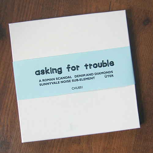

Asking For Trouble was originally the name of my record label and I borrowed the name and logo for my new craft business. All my early logos are just a font I liked and I was pretty shocked looking back at my old packaging photos that my business name was really not prominent at all, let alone a recognisable brand.
![]()
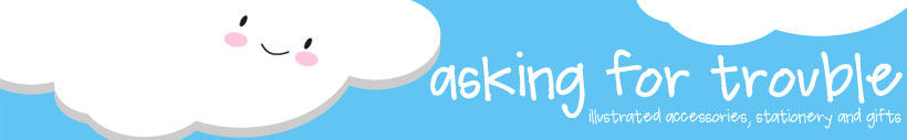
This is my first real logo, which I’ve been using since 2013. It was fine but I don’t draw in that style any more. It also used a watercolour image so the file size was huge and couldn’t easily be resized or used on different background colours.
![]()
Here’s my first sketch from doodling logo ideas on the iPad!
![]()
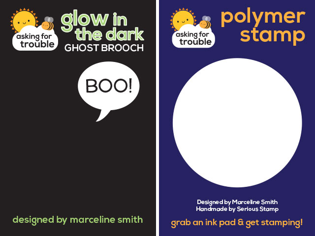
And here’s the next steps. The one on the left was put together quickly to see if it would work as a logo and on my packaging. I then tidied it up – changing the shape of the cloud and resizing elements to fit better and look balanced. They’re small changes but really make a difference.
![]()
And here’s the final logos. I’m sure you’ll agree that it’s much stronger and more representative of my current style. It also works with different backgrounds and dimensions, with space to add a strapline when needed.
I really love how my packaging looks now! I can’t wait until everything matches in the new style but it will take some time to use up all my old packaging and promo stuff. Something to look forward to.